The Visual Revolution in Knowledge Work
Why learning tools like Figma & Miro can give you more influence
Welcome back to the SEO MBA - an email newsletter all about leadership, management and consulting skills for SEO professionals. Housekeeping: due to heavy client load I’m moving to every-other-week for this email starting next week.
Summary: the narrative around tools like Figma and Miro is that they’re “democratizing design” or operating as “virtual whiteboards” but I think there’s a bigger shift at play: there’s a foundational change in knowledge work from documents to canvases. Learning these tools might get you more influence.
When I worked at Google, I was part of a team called the Creative Lab - full of ad agency types: copywriters, designers, videographers, creative directors. The language of the Creative Lab was aesthetics - everything was designed.
The main hallway in the office had these towering 8ft high foam boards where all of the latest work was printed out. As you walked into the office you literally walked through a hallway of all the latest work from the lab - it enabled an immersion and way of seeing that screens are spectacularly bad at.
To those working in visual environments like design or fashion, this might not feel unusual - printing things out and putting them on walls is not new. But for me, coming from the SEO industry this felt alien and mysterious.
How do you design a project to be printed out and put on a wall?
What tool do you use to design something that gets printed on a plotter printer?
Fast forward to the pandemic and we’ve all become increasingly comfortable with “virtual whiteboard” tools like Miro & Figma:
These tools provide an open, collaborative canvas - an infinite, zoomable space for working. These open canvas tools are so much more than “virtual whiteboards” - they’re a foundational new way of thinking about knowledge work - and we no longer need to understand how to operate a plotter printer or Adobe Illustrator to work with them.
Yes, these tools democratize access to design (Figma is free and way easier to use than Adobe Illustrator) but more than that - they change the way that design happens and increasingly allow new kinds of knowledge workers into the process.
SEOs Getting a Seat at the Design Table
The nature of design work is fundamentally changing. As Kevin Kwok says in his essay Why Figma Wins (emphasis mine):
Figma allows closer collaboration between designers and non-designers, but the second order impact of this on the social norms of teams is far more impactful. Historically, there has been so much friction in the design process that design is brought in after most decisions have been made. And conversely, there is a limited set of changes non-designers can push for once the design is set.
Tightening the feedback loop of collaboration allows for non-linear returns on the process. Design can be drafted simultaneously with the product, allowing feedback to flow in both directions throughout the process. Aligning the assets used by design and engineering allow more seamless handoffs, and allows for more lossless and iterative exchange.
Designers can get feedback continuously from engineers or PMs on their team. Some will have sensitivities about non-designers sticking their nose too deep into the design process. In some cases they might be right, but this cost pales in comparison to the benefit to designers.
Bringing non-designers into the process is what gives designers a seat at the table of product and business decisions.
You can flip this whole idea - bringing non-designers into the process is what gives SEO a seat at the table for design. If you understand how the nature of design work is changing then you can better understand how to influence the work, which is a key goal for effective SEO strategy: being able to get things done working cross-functionally with other teams.
A Canvas for Strategy Work
But this visual revolution is bigger than just getting a seat at the design table. It’s about new ways of doing strategy work, new ways of thinking.
The language of strategy is about “10,000ft view” or “birds eye view” or “bigger picture”. But which of our digital tools provide this big picture view? Typically, presentations…. except this linear flow of 16x9 rectangles is not the right tool for the job. Especially when we’re talking about websites.
Websites are experiences, not static images. And whether you’re working on design, product management, SEO or UX you know that capturing a web experience in a document is exceptionally difficult. Which is why all kinds of work, not just design work is leaving documents behind and moving to canvases.
Part 1: Websites as Experiences
Frank Chimero in his essay the web’s grain explores the tension of representing web experiences:
On the left, the Mona Lisa. Cliché, but why the hell not? The painting, to me, is like designing for the printed page. On the right, The Scrabble Game. This assemblage more closely resembles designing for a screen. Do you see it? It is control versus discovery, uniformity versus multiplicity.
With the Mona Lisa, we have fixed, uniform edges that can be planned for with a high degree of certainty and control. We revere and celebrate this painting because of that exquisite control.
With the joiner, we have a different kind of beauty. It is an edgeless surface of unknown proportions, comprised of small, individual, and variable elements from multiple vantages assembled into a readable whole that documents a moment.
Also known as web design.
This “edgeless surface of unknown proportions” that Frank is talking about is why an open canvas is needed to capture, explore and work with web experiences.
Let’s look at the failings of the document model.
From horizontal to vertical
Anyone who’s tried to include a screenshot of a webpage in a presentation knows this pain - websites are inherently vertical experiences - and do not at all conform to 16x9 presentation dimensions. Cutting up screenshots, zooming in and attempting to squash websites into slides necessarily loses something about the full experience.
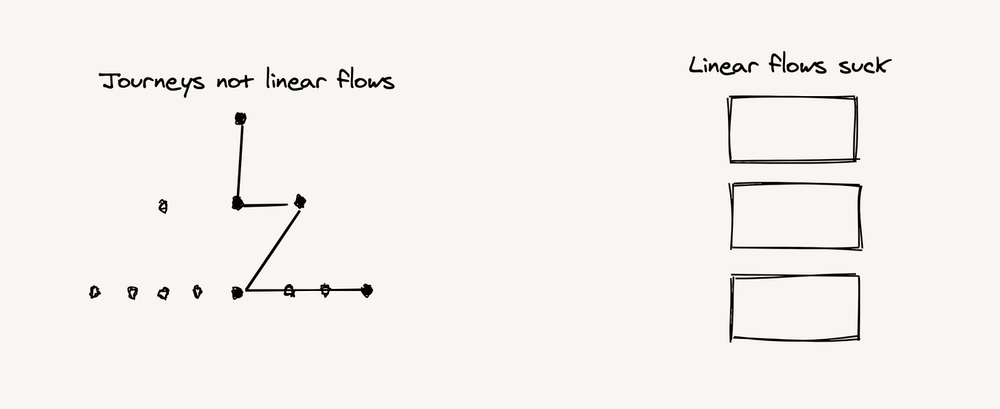
From linear flows to journeys
And further - a series of slides one after another presents user journeys as neat linear flows but that isn’t at all how users use websites - their experience begins before the website and often zig zags through an information architecture.
From structured comments to generative feedback
Treating a document as a space for working invites a very narrow definition of feedback and collaboration. Documents invite specific, “comment based” feedback. I love Google Docs comments - they’re truly best in class. But they still invite a kind of block-level feedback - it invites structural refinement as the core feedback, where an open canvas invites a generative exploratory feedback.
For example - look at this close reading of a PDF in miro:
The feedback that an open canvas invites is far more generative than in-line comments.
Part 2: Ways of Seeing a Website
How do you see a website? As SEOs we’re often “looking” at a website through it’s information architecture or folder structure. But this is a terrible way of looking at a website as experience. Documents, with a fixed zoom resolution, are terrible at understanding relationships. As Craig Mod writes in To Make a Book, Walk on a Book:
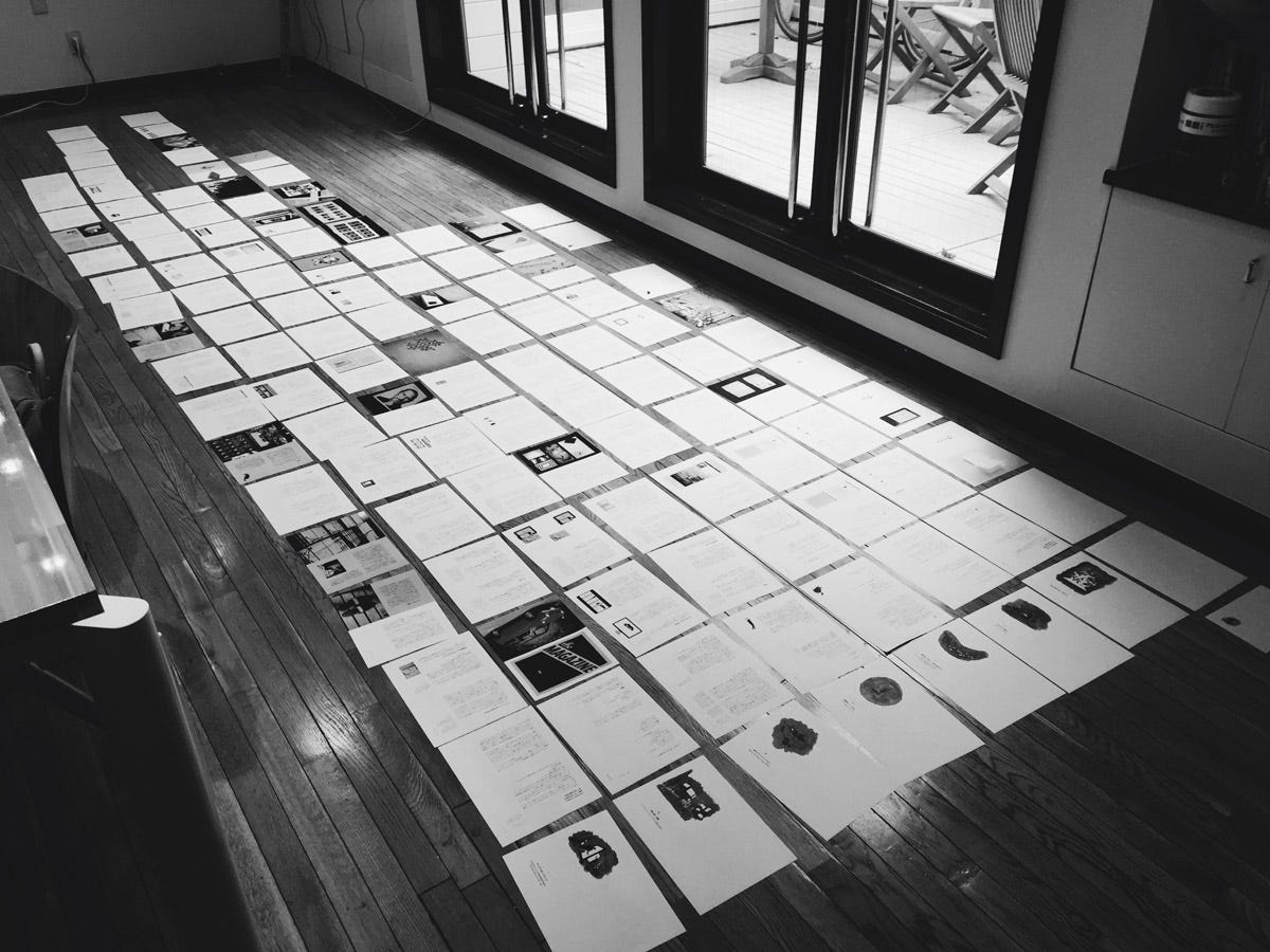
The ability of the physical world — a floor, a wall — to act as a screen of near infinite resolution becomes more powerful the more time we spend heads-down in our handheld computers, screens the size of palms. In fact, it’s almost impossible to see the visual patterns — the inherent adjacencies — of a physical book unless you deconstruct it and splay it out on the floor.
Craig is talking about books - but it’s true for websites too. It’s impossible to see the visual patterns, adjacencies and relationships between things in a static document. Printing out a website and walking over it sounds nice but not very practical (though I’ve seen teams do it!). Open canvases are good at this though - enabling a way of seeing a website, or a set of webpages side by side. Here’s a screenshot from a project I worked on earlier this year - where we’re analyzing the careers page of some competitors to see what we can learn:
This zoomable, scannable experience enables the exact “big picture” viewpoint needed for strategy work, where we’re looking for patterns, insights and systems.
Part 3: Knowledge Work on the Canvas
So if you’re in the business of working with websites - maybe a canvas is useful. But how?
Here’s three ways I use it in my consulting work:
1. Seeing a Situation
As a consultant it’s important to get a fast situational awareness for a client’s website, and industry. A kind of zero-hour “what does it look like”? For this, I enjoy putting together a visual analysis of a single keyword, something like this:
That’s the Google results page on the far left and ordered 1-10 the top 10 websites ranking for the keyword.
This kind of analysis allows for a very quick mental model of which websites have which features, what a user might consider when choosing between websites and different types of site.
2. Annotating a website
How do you provide feedback on a website? 16x9 boxes are bad at this. Here’s an example from my own work - where I’m providing feedback on a new page template. Here’s 5 key pieces of feedback on a single page template:
3. Concepting New Ideas
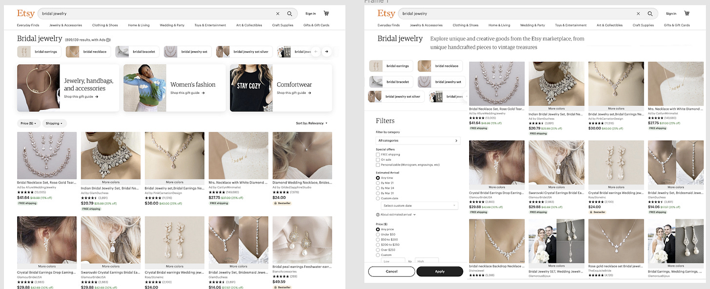
Sometimes it’s valuable to create new ideas and ways of thinking about a client’s site. For example - let’s say that I was trying to illustrate my idea for making Etsy landing pages look and feel more like ecommerce landing pages, especially for high value keywords I might mockup a page like this:
It’s a provocative sketch, not quite a wireframe, not quite a design, a sketch of what could be. This takes 5 minutes with a little remixing of screenshots, inspect element and moving things around in figma. The point is not to “do design” but rather illustrate your idea in a clear and compelling way.
In summary - knowledge work is changing. From design to strategy work, I’m increasingly seeing canvas-based tools overtake document-based tools. This matters because new tools enable new forms of collaboration and SEO is fundamentally cross-functional. Learning how to use these tools might give you greater access and influence across different functions. There’s a visual revolution happening, don’t get left behind.
Further reading:
Some links for those looking to learn more about how to work with these visual tools:
If you’re new to these tools check out Figma for non designers, or Spotify’s ways of working in Figma or Miro guides for ways of working.
If you’re already using them but want to go further: Remote Workshops Using Miro: What I’ve Learned So Far
And if you want to really dive into the theory - the concept of the one page strategy canvas is a great deep dive


Hey Tom!
Thanks for this cool blog!
As a site generator I would add https://octopus.do/sitemap/resource/generator
With Octopus.do also easy to create website structure — https://octopus.do
for objectivity about Octopus.do you can ask Google where we are in the TOP3 relevant queries :-)
Tom .. excellent info..
One more Viz tool to consider for your auditing toolkit: https://VisualSitemaps.com
it is 100% fully automated and provides a visual architecture + screenshots you can annotate with your team/clients while you plan a better architecture/content strategy. Oh, and it also does Automated QA.. in case things shift while in flight.
;-) cheers